Apple Watch
Elegant, Ergonomic, Revolutionary
Elegant, Ergonomic, Revolutionary
It’s good at tracking activity and health, but interacting with it is a bit complex. The current Apple Watch is based on the design of the iPhone, it’s basically a small iPhone. But the iPhone multi-Touch technology does not serve the interactions of the watch well : difficult to reach the desired button on the small screen, no physical feedback....

We should be able to do more with the Apple Watch. It’s even more true now that iPhones are getting bigger and bigger and therefore less convenient to pull out of a pocket. With the rotating crown you can select more easily the desired button by rotating up or down, or click on the crown to validate a choice.
Apple applied the iPhone recipe to the Apple Watch : a rectangle Multi-Touch screen and a big App Store. Those two things are responsible for the success of the iPhone. But it’s not the best for the Watch. During the 2014 Special Event, a strong emphasis was put on the Apps, but today most people don’t really install many apps because they are too complicated to interact on the Watch. Instead they just use the notification they get on their Watch and not native Apps. Bringing a better User Interface thanks to a better input method will solve it and allow people to do even more with their Watch.
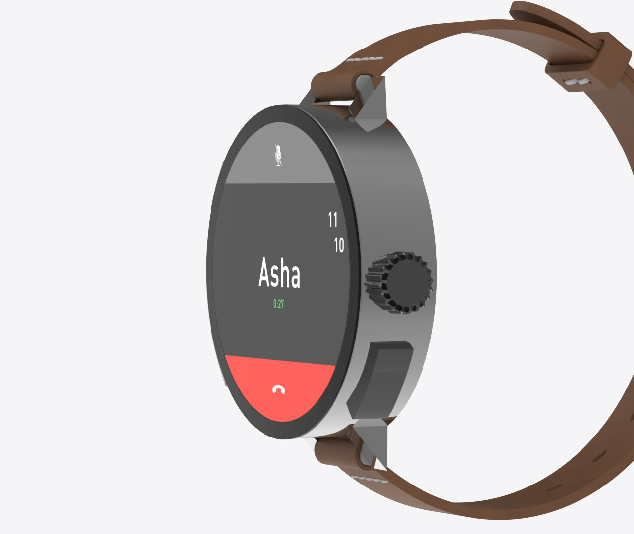
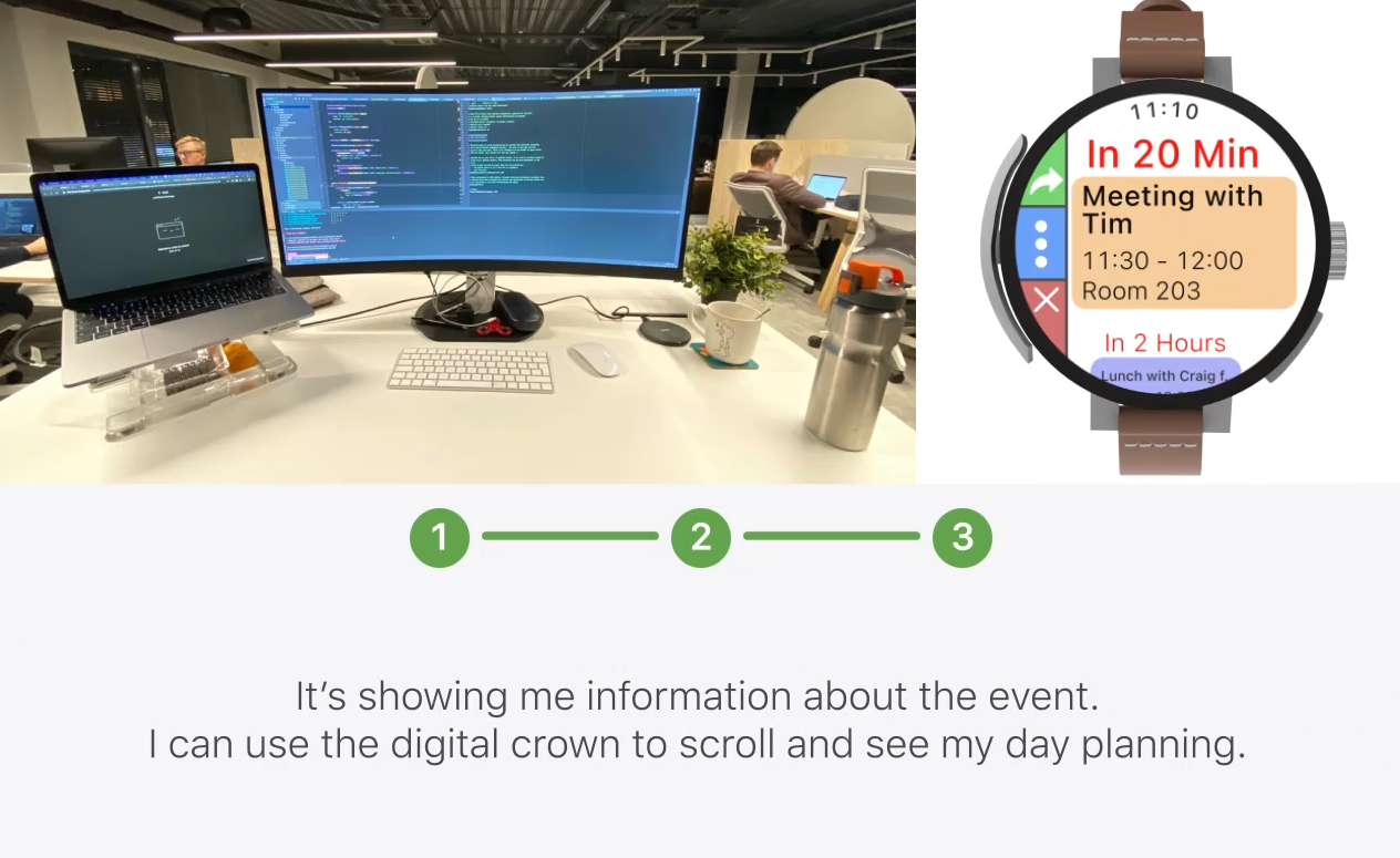
The rotating crown is an interaction method located on the left side of the watch. It's shape as a circular piece of metal that rotates along the watch. It can rotate up or down. You can also push it like a mouse click. It contains Touch ID, allowing the user for a quick authentication.
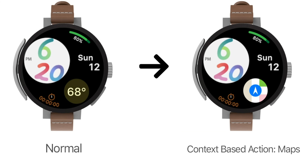
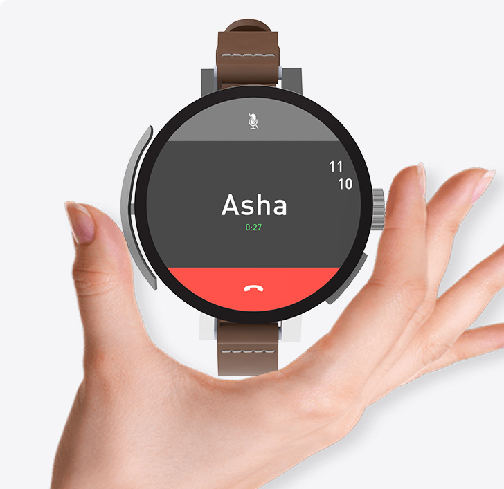
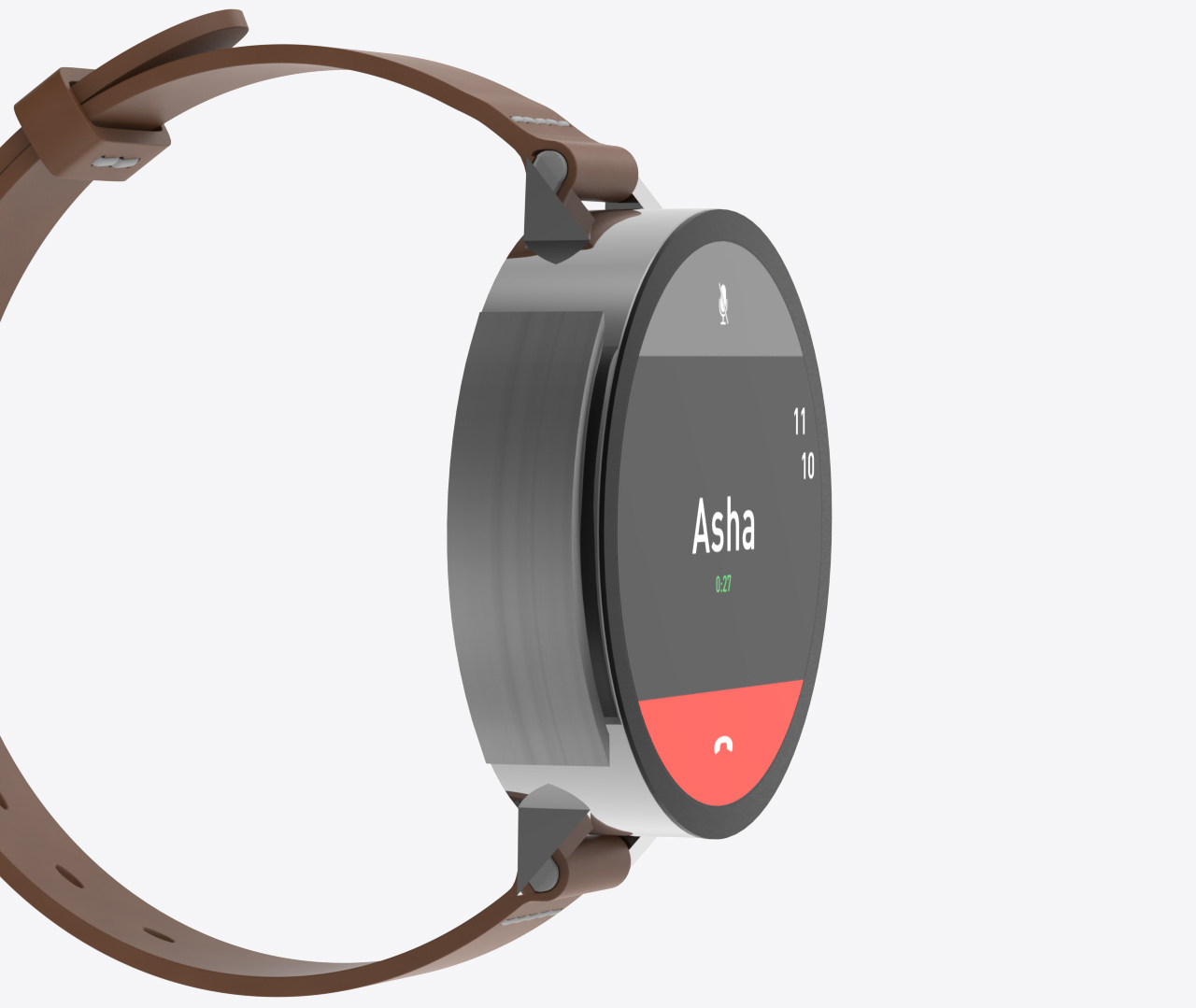
When someone is calling you, you can quickly answer by rotating the crown up. Depending on your position or activity, Siri can suggest quick action. For instance, when you get home you could have the Home App shortcut. The rotating crown allow for quicker interactions and without hiding the screen with your finger. It's easier to design richer apps and more intuitive interactions.
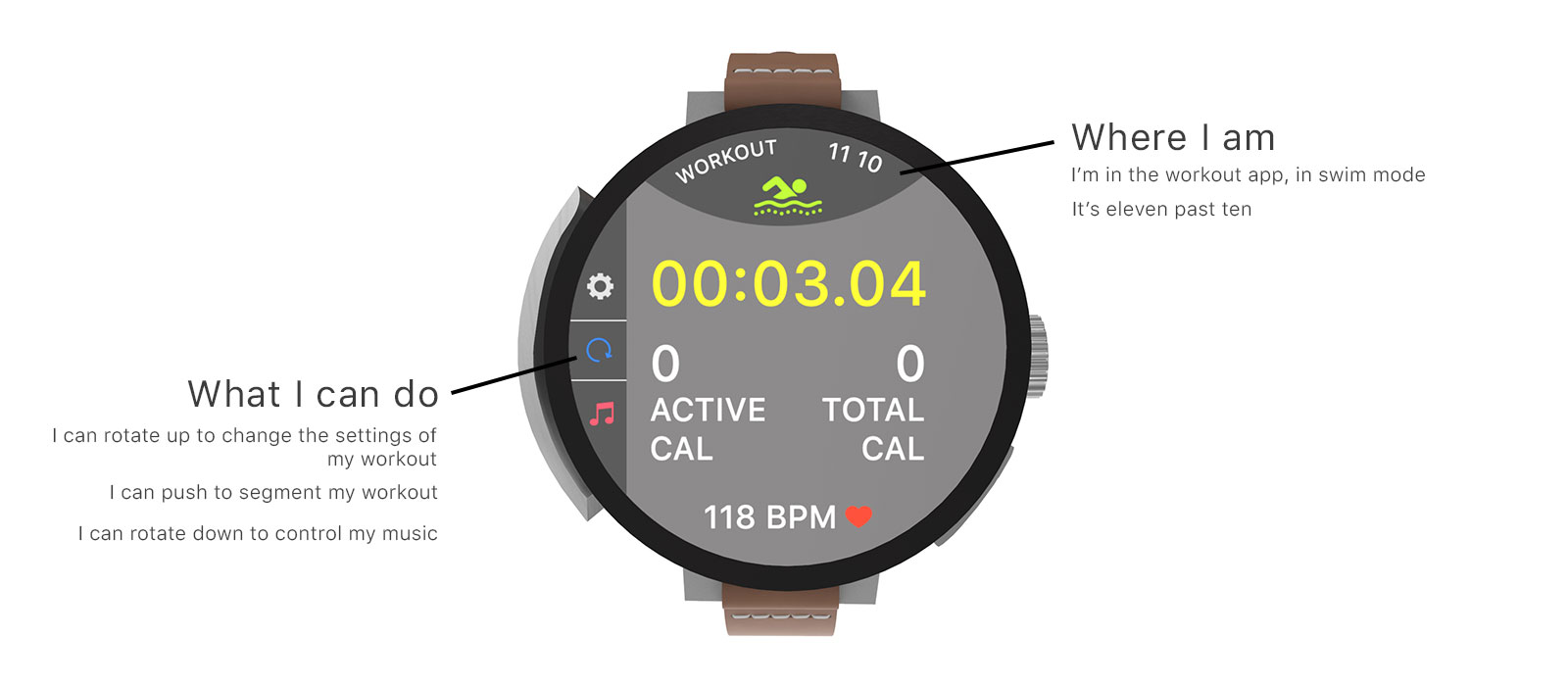
The notification screen takes full advantage of the watch round shape.
Controls appear on each side. The
left side indicates what happen when you rotate the crown up or down. The right side indicates that
pushing the Digital Crown will bring up the home screen (icon of the home button from the first iPhone).
It also indicates that pushing the right button will bring up the dock. The top side shows the name of
the current app.

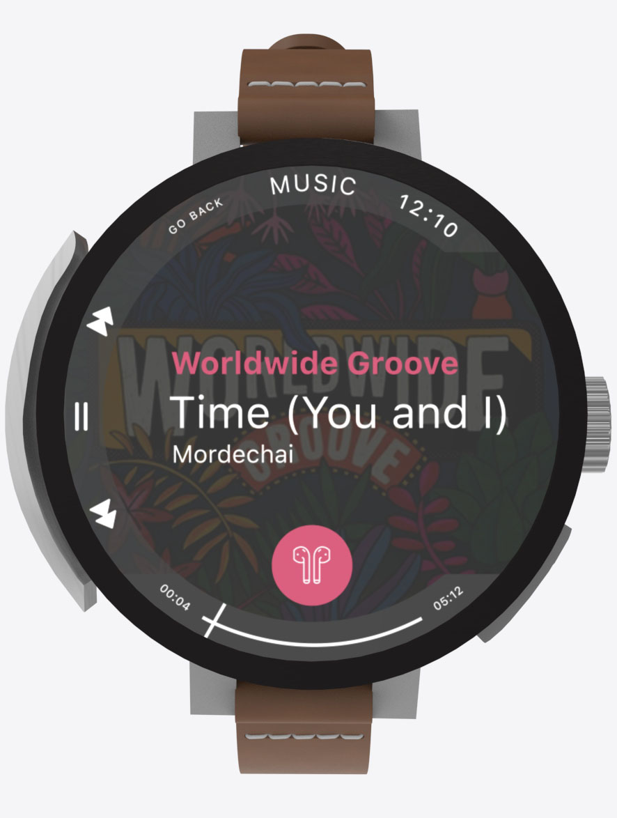
The rotating crown gives more affordance. The symbols on the screen are signifiers, they help the user knowing what the rotating crown does.
The controls are displayed next to the rotating crown indicating what the rotating crown can do. New users can take it in hand quickly, and pro users can use it almost without looking.
Having a physical control over the UI allow the user to scroll and navigate quickly through the playlist or album list. The same way as the click wheel on the original iPod, you can rotate up to scroll forward and rotate down to go scroll backward. You can rotate multiple times in a row to scroll faster, or keep rotating to go even faster. Then you can use the digital crown to scroll through the playlist or the album.
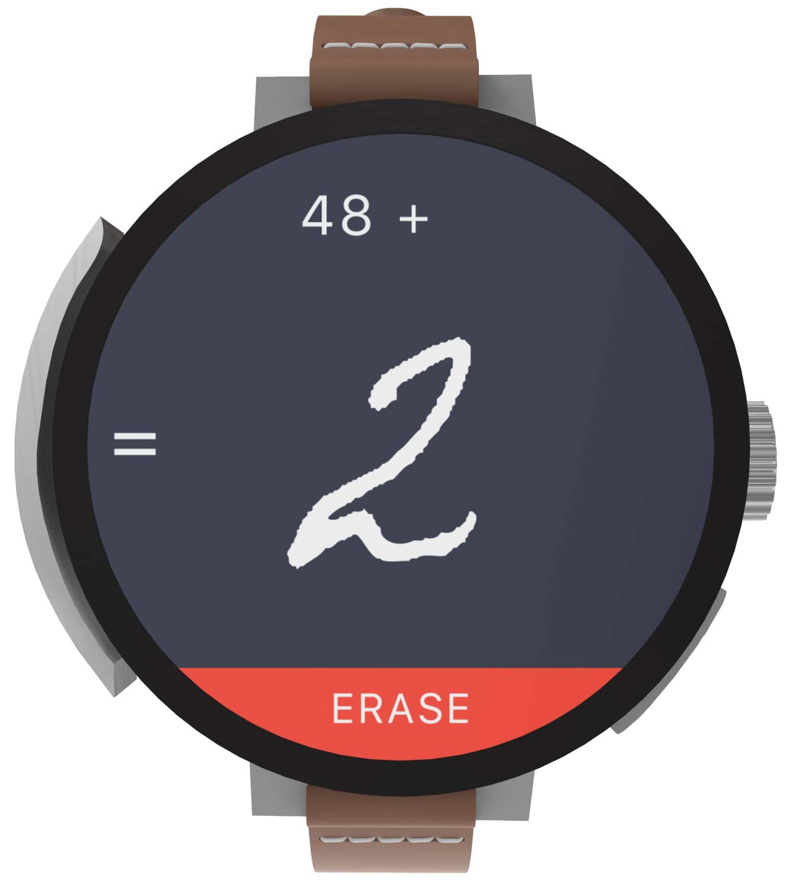
Multi-Touch as a last resort.
Use the multi-touch screen to draw numbers, and use the rotating crown to interact with the app.
For instance, you can push the rotating crown to get the result or scroll to have more
options. You can write literal expression like 59 - 20% and get the result. Or else, talk while pushing the rotating
crown to dictate numbers or the full operation.
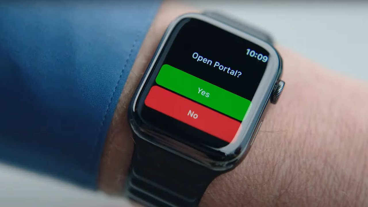
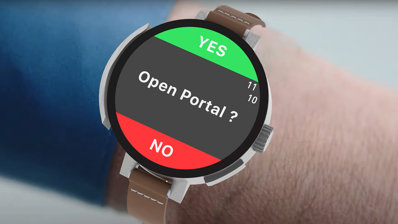
During the 2021 WWDC, Craig Federighi used his Apple Watch to trigger a portal. This situation is actually quite representative of a typical Apple Watch use case: a screen with one question and two answers : Yes/No or Forward/Backward. The rotating crown allows for a quick selection : rotate up or rotate down.
The round shape of the watch allows your thumb and index to naturally fall on the 2 main input method : rotating crown and digital crown. You scroll with your index and then you select with your thumb.
The key of this concept is the rotating crown. Designed to give more possibilities for interactions, it’s good at selecting an input. It’s more efficient than using the touch screen to touch a button. It can also be used to navigate more quickly between screens of an app.
The digital crown is still here, doing what it does best: scrolling through content. The rotating crown and the digital crown work together to cover a greater number of possibilities for interactions.